World Heritage Site

When approaching the design for my World Heritage Site, I wanted to focus on an aspect outside of the usual physical sport activities. I wanted to showcase the natural features of the otherwise rugged terrain and highlight the inner beauty of it. I wanted to make the Dolomites a destination wedding location, so I utilized the masculine mountains and feminine flowers to appeal to everyone’s senses. I chose to go with a masculine typeface for the paragraph texts, and a feminine type face for the headers and main text of the logo as a means of continuing the playful push and pull of the two elements. I think the ability to tug on emotions is a power of graphic design. Highlighting the importance of the outdoors is still essential when talking about the Dolomites, but it doesn’t have to be the main focus.

The front and back of the brochure

The inside pages of the brochure

The brochure mocked up

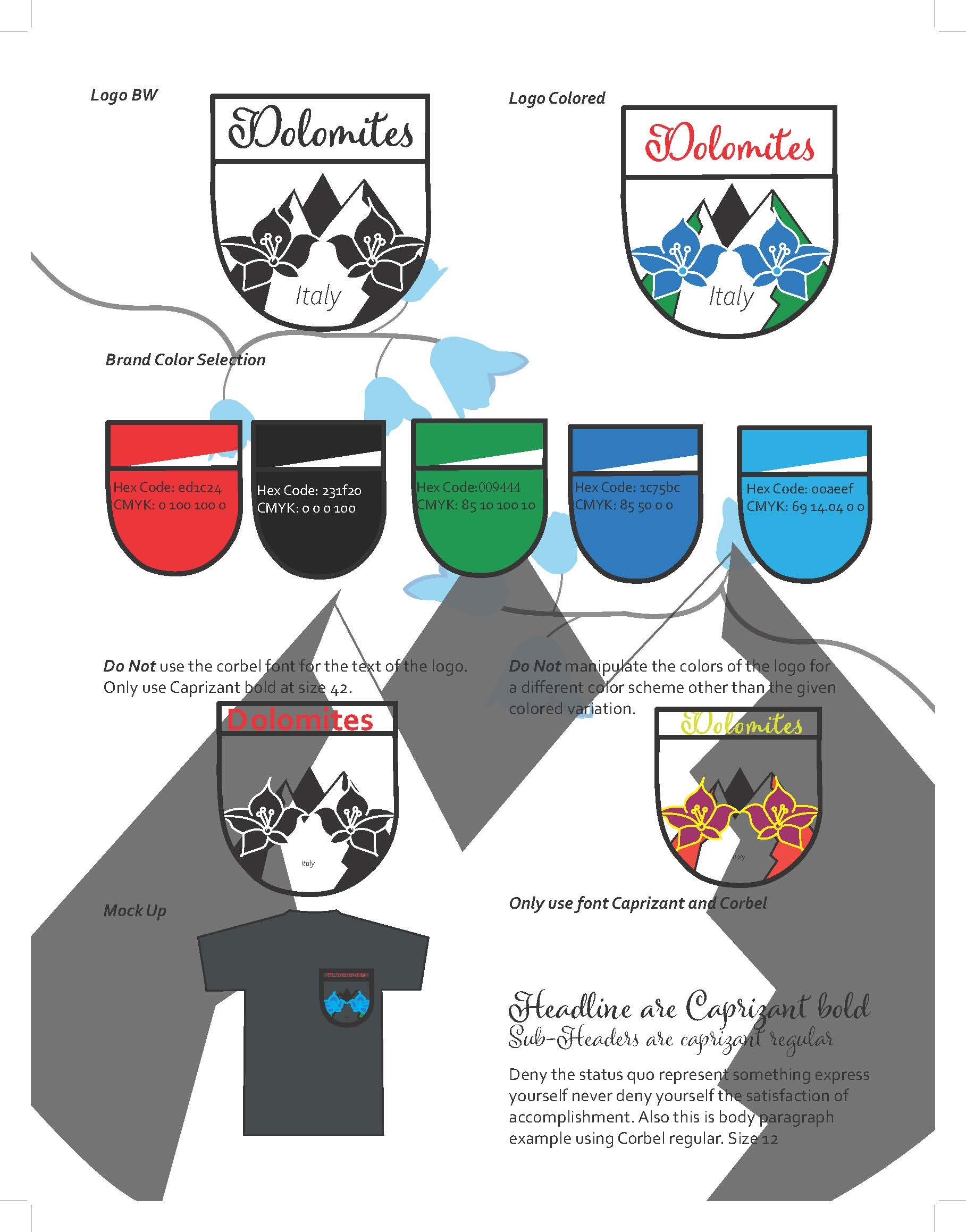
The branding sheet
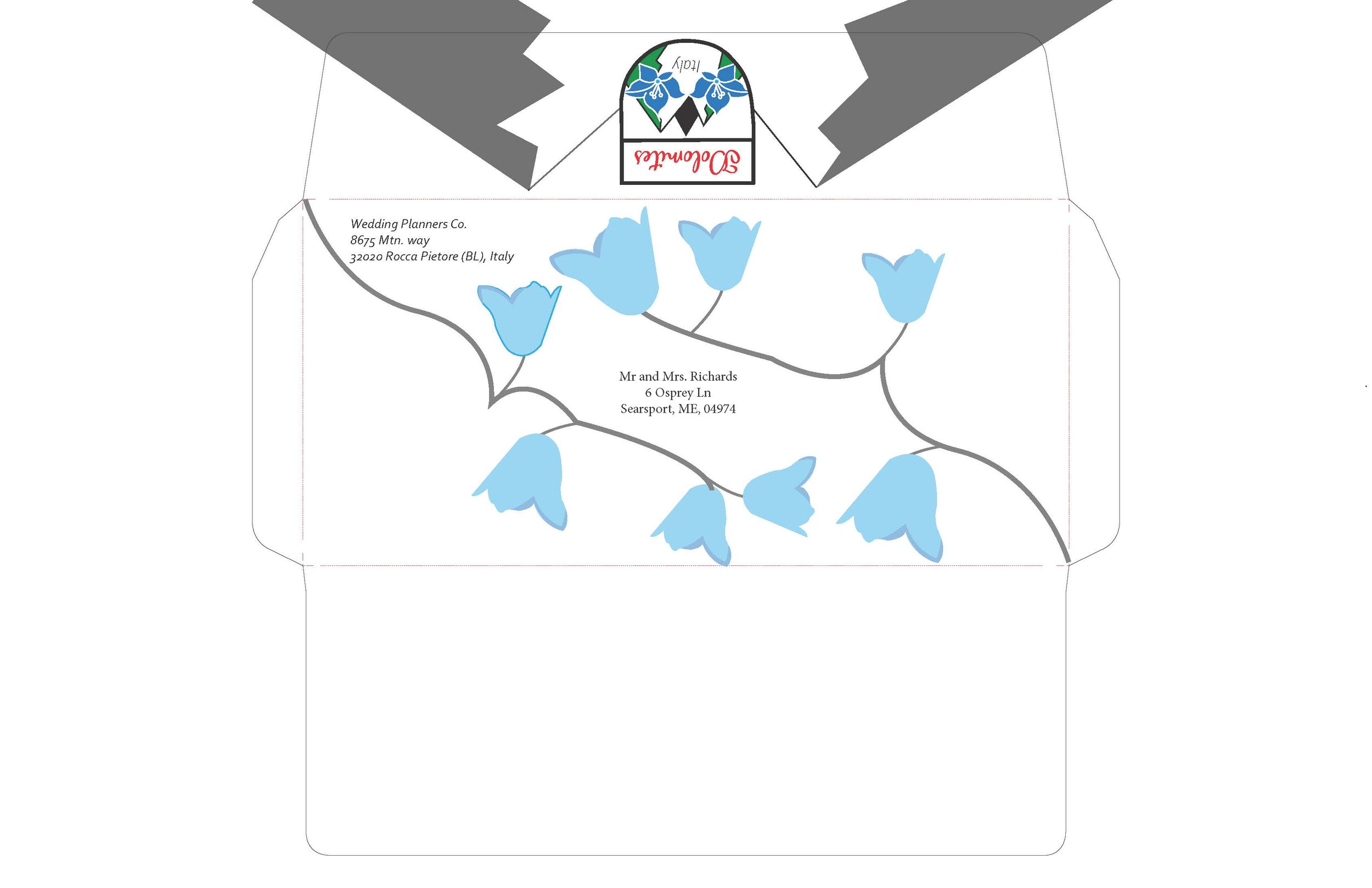
The envelope flat
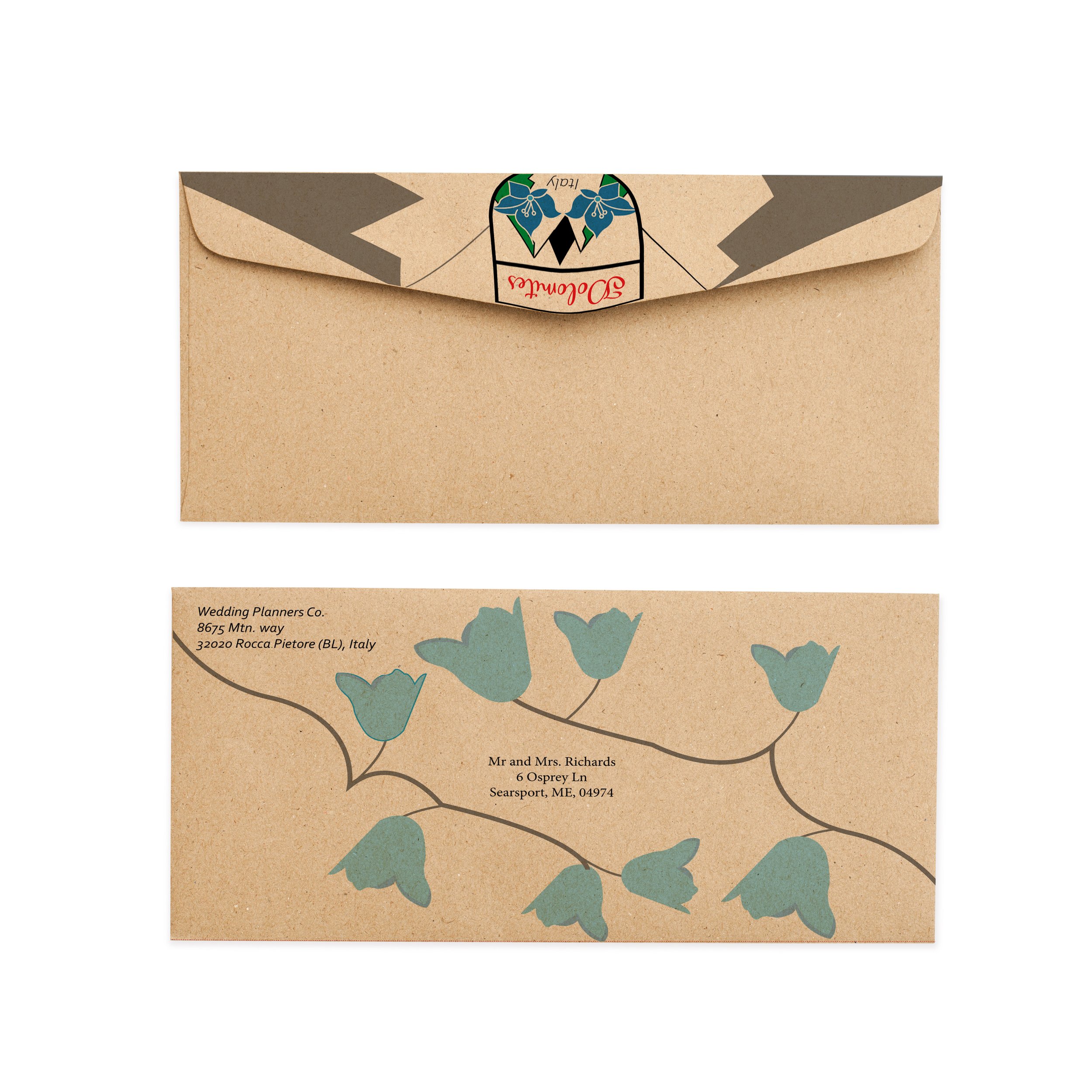
The envelope mocked up
The back of the business card

The front of the business card

The Business Card mocked up

Letterhead mocked up


